Your home is one of the places you spend the most time, so it should reflect who you are. But using colour can be intimidating. Not only is it a bit scary (what if you pick colours that don’t work together?) but if you do get it wrong, it can be costly to correct!
So if you’re a newbie, how do you start? Our beginner’s guide to introducing colour to your home will give you everything you need.
think about the vibe you want to create.
Colour is hugely impactful. It can affect the way you feel in your home, so before even considering colours, think about the way you want your home to feel. You might want an energising feel for your bathroom and a soothing feel for your bedroom, or a vibrant feel for the dining room when you’re entertaining and a comforting feel for the living room as you curl up in front of the TV.
Colours and colour schemes will help you create that feeling. While yellow is bright and vibrant, blue is more calming, pink is playful and white is fresh and clean.
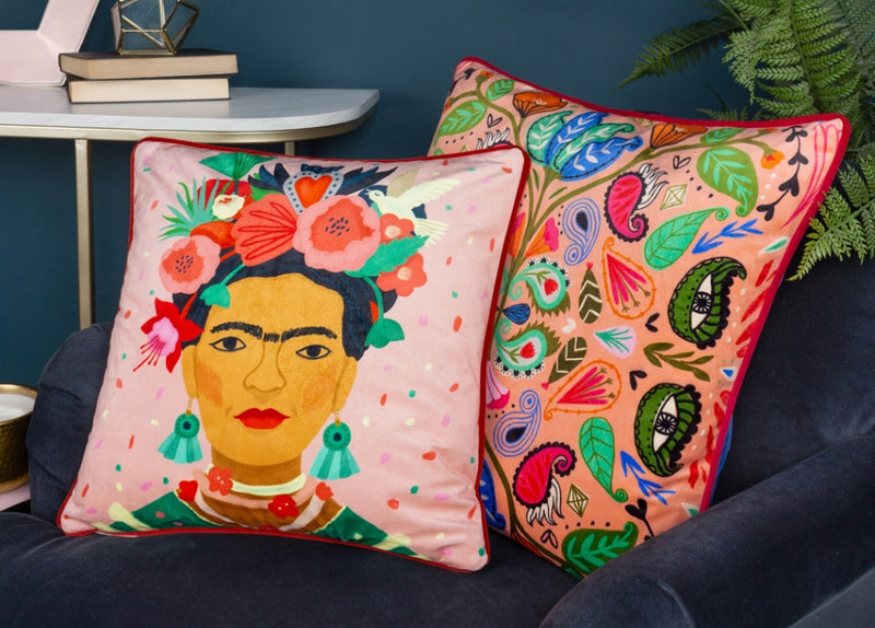
Photo credit: @fix_no_166 has created this perfect complementary coloured orange and blue interior. This colour scheme is absolutely perfect even down to the in-keeping fresh flower centre piece! (Cushions pictured: Nomi Monoprint, mustard)
find a jumping off point.
If you’ve never really used colour in your home before, it can feel nerve-wracking trying to do it for the first time. What if the colours look awful together? What if they kind of work, but you just don’t love it and you don’t know how to fix it?
Luckily, there’s an easy way around this! All you need is a jumping off point. It could be a piece of artwork that you love, a wallpaper pattern or even a cushion! Look at the colours in that piece and pick out three or four main colours. Voila, you have your colour scheme ready!
Still struggling? Try looking in your wardrobe for inspiration. It might be picking out the colours in a particular printed blouse that you love wearing, or it might be just looking at your clothes overall – what colours do you tend towards wearing? It could give you a good indication of colours that you’re drawn to and would work well in your home.
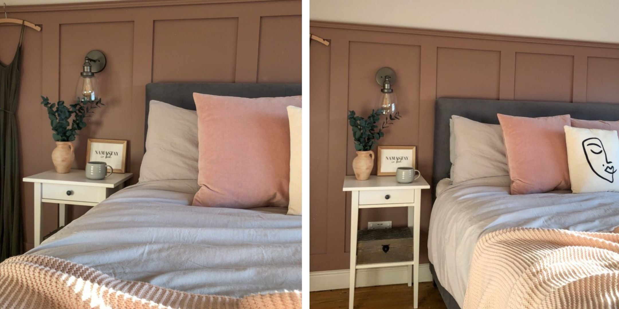
Photo credit: @athomewiththeraines has tonally created this perfectly pink bedroom with wood flooring, white and grey neutrals. How cosy and inviting does this look? (cushion pictured: Sunningdale Velvet Square Cushion in Powder)
create your colour scheme.
A good colour scheme includes three colours, maybe four, plus neutrals. There are lots of ways to put them together, but first, you need to grab a colour wheel! Using this handy tool, you can put schemes together in one of three main ways:
- Monochromatic, where all three colours are different shades of the same hue. It doesn’t have to mean black and white, it can be various shades of orange, or blue. This is super serene and calming.
- Analogous, where the three colours are next to each other on the colour wheel. For example, it could be orange, red and yellow. This has a little more energy, but can still be soothing, depending on your colour choices.
- Complementary colour schemes are where the colours are opposites on the colour wheel, like purple and yellow. This can be super impactful and contrasting without clashing.
When you’ve got a selection of colours that you like, put together a mood board. Include colours, finishes, furnishings, furniture, metals – everything. Putting them altogether means that you can see how they will all interact, and getting samples gives you extra context in terms of how the textures work together.

Photo credit @my_house_on_abbey_road has made their interior look really bright and spacious through their use of the neutral walls and contrasting this with statement bright bedding and bold ornaments for a modern style. (duvet cover set pictured: Kindred Abstract Faces)
think about where you want to see the colour.
The generally accepted rule about colour in the home is that it should follow the 70/20/10 rule. This is where you keep one colour to 70% of the elements (usually the walls, floors or big pieces of furniture), a second colour to 20% (prints and fabrics) and a third colour to 10% (your accents and accessories).
This is a tool to help you put together a colour scheme easily, but you can tweak it to work for you (you might also find it as 60/30/10 rule so you know you have space to expand if you really love a particular colour). Use it alongside a colour wheel and colour palette to help you create a scheme that you’ll love.
This should set you up for introducing colour confidently into your home!