fresh-fallen chestnuts, thick syrupy molasses + bushy whitetail fawns.
Ask anyone the classic question, the age-old icebreaker – “what’s your favourite colour?”, and you can almost guarantee that a passionate, soul-stirring rant about brown won’t be their response. For a universal shade that exists in such abundance all around us – from great towering tree trunks to the clayed layers of soil beneath our feet – it’s a bit surprising that brown often gets overlooked when it comes to home decor.
But our resident interiors expert and furn.com brand manager Anna has quite a bit to say in defense of brown. "Earthy brown tones are perfect grounding colours that do a great job of replacing what grey did for many homeowners". Resembling something like grey's friendlier older cousin, brown tones "can work in most homes no matter what lighting you have, as it's naturally warming", Anna says.
Those tuned to the ebb and flow of interior trends will know that brown’s been having a bit of a moment recently. Whether it’s a response to the chokehold that grey has held over interiors for the better part of a decade, a retro nod to the chocolatey playfulness of ‘70s kitsch or a simple embrace of the earthier shades that have dominated recent trend palettes – all we know for sure is that brown is back, and it’s quickly blazing a cocoa-dusted trail.
In this colour deep dive, we’re going beneath the surface on all things brown – from its complicated history to what colours go with it, as well as how you can use it in your home.
If you’re ready to delve further into the world of colours, why not take a look at our deep dive: pretty in pink interiors? It covers the surprisingly dramatic history, best colour pairings and most eye-catching pink decor ideas.
It’s tough to think of a colour that feels more misunderstood, cast aside and – in the worst cases – stigmatised than brown. The Ancient Romans certainly weren’t its biggest fans, giving their lower social classes the name pullati, which literally translated to ‘those dressed in brown’. Franciscan monks in the Middle Ages wore undyed brown robes as a symbol of poverty and humility, reflecting the hardship of the peasants they served.
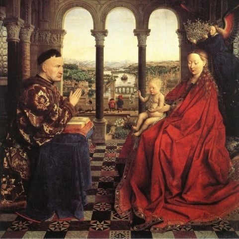
It wasn’t until the late 1400s that brown started getting some long-overdue love. The arrival of the Renaissance period and oil painting placed brown front and centre at last, with artists flocking to natural mined pigments like umber and sienna. Readily available, quick to dry and a lot easier to paint over than black – brown shades suddenly became a valuable asset, and popped up in the work of Renaissance artists like Jan van Eyck and Leonardo DaVinci throughout the 15th century.
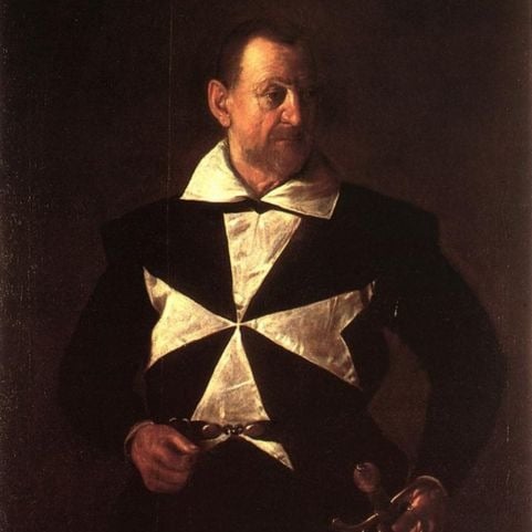
The 17th and 18th centuries saw brown go from strength to strength. It was an essential part of creating the chiaroscuro effect in portraits of the era, which made subjects look like they were emerging from darkness.
Like with many things, the situation with brown became a little unhinged through the eighteenth and nineteenth centuries. The brown craze of the Renaissance period was met with a hard non from French impressionists, whose enchantment with bright primary colours meant brown fell firmly by the wayside.
A shade known as ‘mummy brown’ reached peak trendiness around the year 1850. A warm, rich tone with great transparency for glazing, shading and creating shadows in paintings – mummy brown quickly became a hot commodity.
Wondering about the name? You’ll probably wish you hadn’t. Yes… the paint was made from the actual flesh of real mummified bodies. At peak popularity, when mummy stores were running low, artists resorted to the corpses of enslaved people or criminals to create the unique shade.
Brown’s roller-coaster history hasn’t exactly quietened down in more recent years, either. The colour became a western symbol for wholesome simplicity towards the end of the 1900s, with brown paper bags, wrapping paper, bread and sugar all becoming hallmarks of a healthy suburban life.
The 1970s saw a complete vibe change from the retina-sizzling neon palettes of ‘60s decor, with gentle earth tones coming fiercely to the fore. Chocolatey sheepskin rugs, leather modular sofas and sandy shag carpets – we’re all familiar with the look, and like it or loathe it, the ‘70s made brown decor iconic.
Brown is a bit unique when it comes to its place on the colour wheel. It’s basically a mixture of the three primary colours – red, yellow and blue – but that’s not the only way to create it. Mixing secondary colours like orange and blue or red and green will also make brown, and blending complementary shades (those opposite each other on the colour wheel) will do the same.
In terms of building a colour scheme, brand manager Anna wholeheartedly sings brown's praises. "It's naturally warm in tone, so other warm colours like ginger, ecru and earthy greens are a match made in heaven".
Like how natural woods work amazingly to calm the feeling of a space, brown "can be a great colour to ground any colours you like. Light to mid shades tend to be easy to pair with other colours, and offer a great place to start" Anna says.
The good news is that this opens a lot of doors when it comes to coordinating colours in a brown decor scheme.
brown and white.
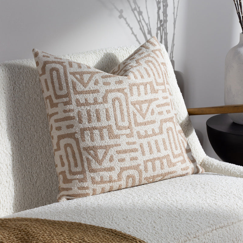
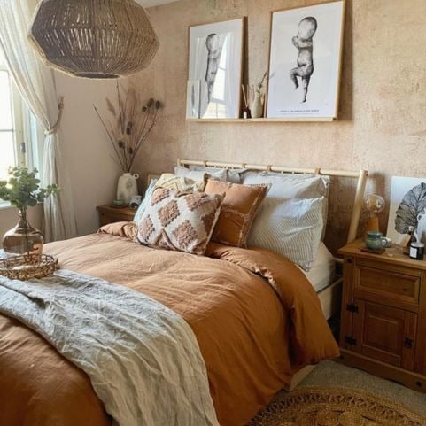
A classic, timeless combo that’ll bring the perfect touch of warmth to any minimalist space – you can never go too far wrong with brown and white. Rich, dulcet shades like chocolate and pecan brown sit in perfect harmony with bright whites and creamy beige tones, and will fit effortlessly in any interior style.
brown and blue.
Brown and blue are complementary colours, meaning they sit directly across from each other on the colour wheel. Using them together creates instant impact and visual interest that’ll naturally draw the eye. Lighter wood tones like tawny and caramel work beautifully with deep, sophisticated midnight and navy blue shades.
brown and green.
A classic case of Mother Nature doing it best – brown and green is a lush, earthy combination that’ll make any space feel like a cosy autumn hideaway. Organic woodland browns like walnut and hickory work stunningly with earthy olive green shades, and will give your home the perfect boost of nourishing vitality.
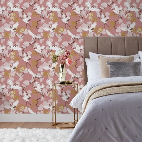
brown and pink.
Mirroring the tones of nature will always leave you with an effortlessly satisfying colour scheme, and pairing brown with pink is a classic example. Any selection of shades will work in harmony, but this combination particularly sings when dusty pink meets earthy brown. Peach or coral pink shades have reddish-brown undertones, meaning they’ll mix like a dream with strong cedar and mocha browns.
While we brazenly support brown decor and all the versatile earthy goodness it brings, we’ll be the first to admit that it’s easy to end up in a taupe-toned trainwreck. Luckily, Anna's got some top tips when it comes to smoothly integrating brown shades in your decor: "To avoid looking dull, try using no more than two or three shades from the brown family in one space, and pair with lighter neutrals to freshen the colour palette".
For the more brown-wary among us, Anna suggests introducing "a light taupe or biscuit colour and building from that. Dark browns can be tricky, so it's best to try nutty, lighter shades if you're not sure".
We’ve put together a handy list of tips and tricks to make decorating with brown a bit more doable.
find your shade.
From rich roasted mocha to breezy desert tones, brown is anything but a one-note shade. It’s got the potential to create a massive variety of moods – from intense and enveloping to raw and earthy – and the shade you choose will make all the difference.
Go with orange or red-tinged clay shades for an organic summery vibe, or opt for a sophisticated look with rich cocoa tones.
act natural.
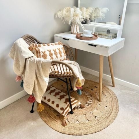
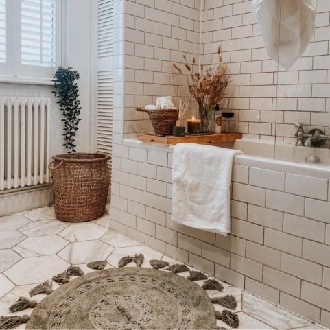
If just the thought of brown decor has you breaking out in cold sweats, there’s always the option of easing yourself in with some natural brown accessories. We’ve got tons of wooden light fixtures, mirrors and furniture that’ll bring a healthy splash of organic brown without the stress of choosing between shades.
embrace earthiness.
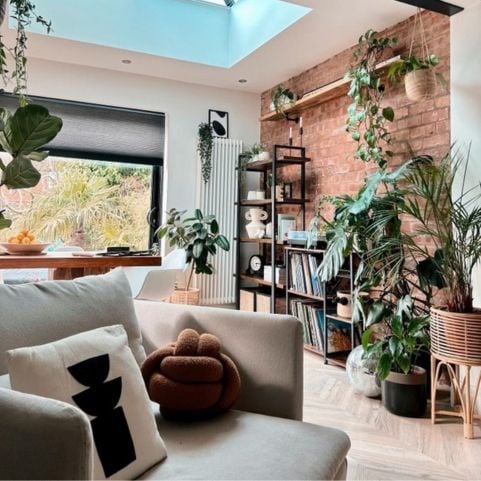
One of the biggest reasons for brown’s resurgence is the ongoing trend of organic and earthy colour palettes. People are craving connection with nature like never before, and the growing appeal of brown decor is one of the tell-tale signs.
Think tranquil beige wallpaper, cosy pecan throws and jute cushions punctuated with a healthy spread of lush green houseplants.
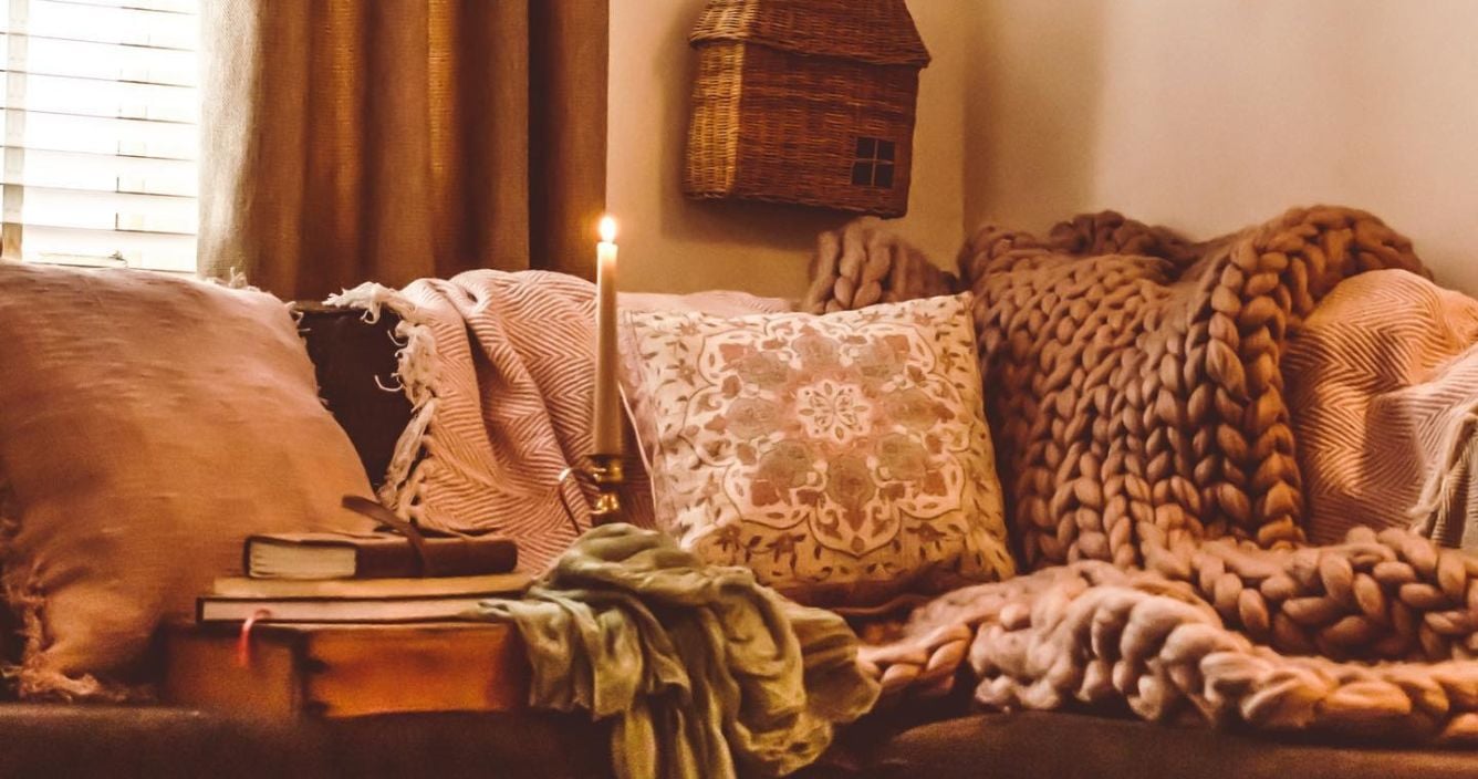
tanned textures.
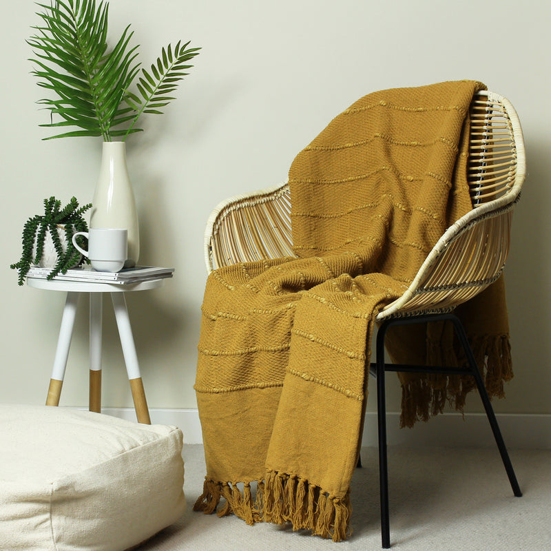
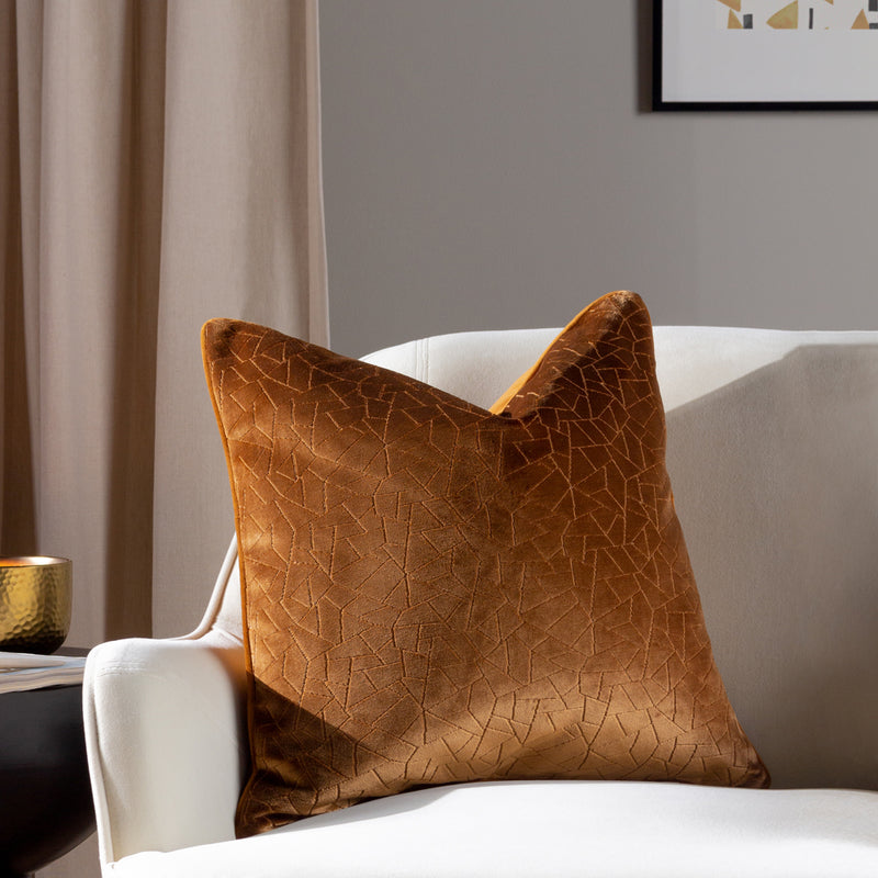
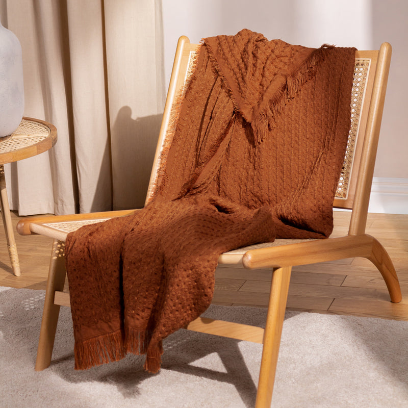
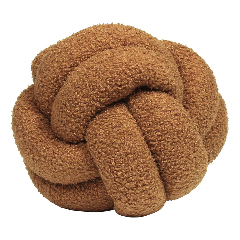
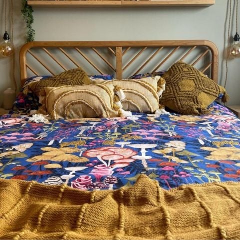
Browns of all varieties have a reputation for being warm and comforting, and there’s no better way to highlight those qualities than by experimenting with different textures. Our brown cushions collection is teeming with everything from fuzzy bouclé finishes to sumptuously soft velvet – perfect for creating layers of visual depth while dialing up the overall warmth of your space.
shop brown decor.